Choice Organic Tea
Brand Repositioning
While the largest organic tea line in North America, Choice was facing increased competition from well-funded upstart brands that were conjuring, co-opting, and cluttering the tea category. Choice needed to defend its turf and solidify its position as a category leader and pioneer in organic, fair trade tea. They brought egg in to clarify the brand, increase awareness, strengthen their base, and expand outward.
Through the strategic brand planning process, we determined that Choice’s true differentiation was built right into brand and manifest through its many true stories around sourcing, buyers, and relationships, as well as the organization’s expertise, knowledge and deep passion for great tea. In one word, authenticity.
We helped Choice embrace a positioning as the tea specialist, the brand for people “in the know” on quality, and as the truly “honest” tea brand. This positioning allowed us to implicitly de-position the competitive brands as contrived without explicitly naming names.
Identity and Packaging
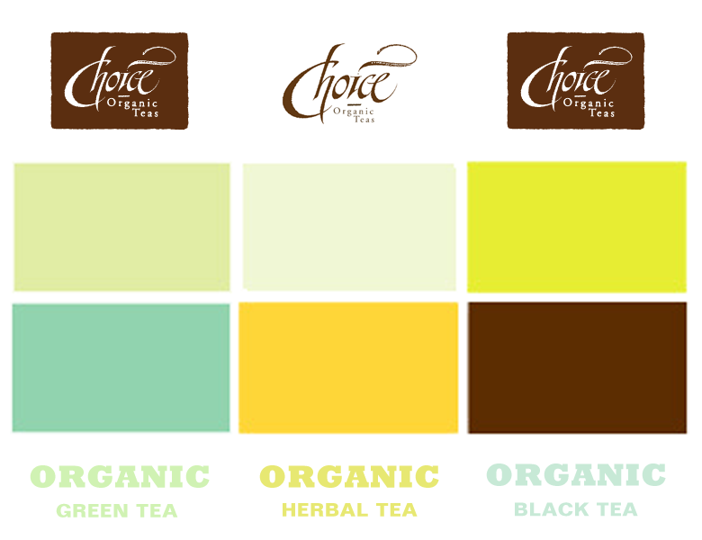

Working with the existing logo, we solidified and strengthened the overall brand look and feel by introducing motifs that reflected category authenticity and purity. Our new color family revitalizes an antiquated look with a palette drawn from the colors of the regions in which our teas are grown. The type and texture classification presents bold and classic themes drawn from import-export language. A simplified packaging system organizes an extended and unconnected family of SKUs into a simple variety-based architecture system.
Visual Brand Language Study
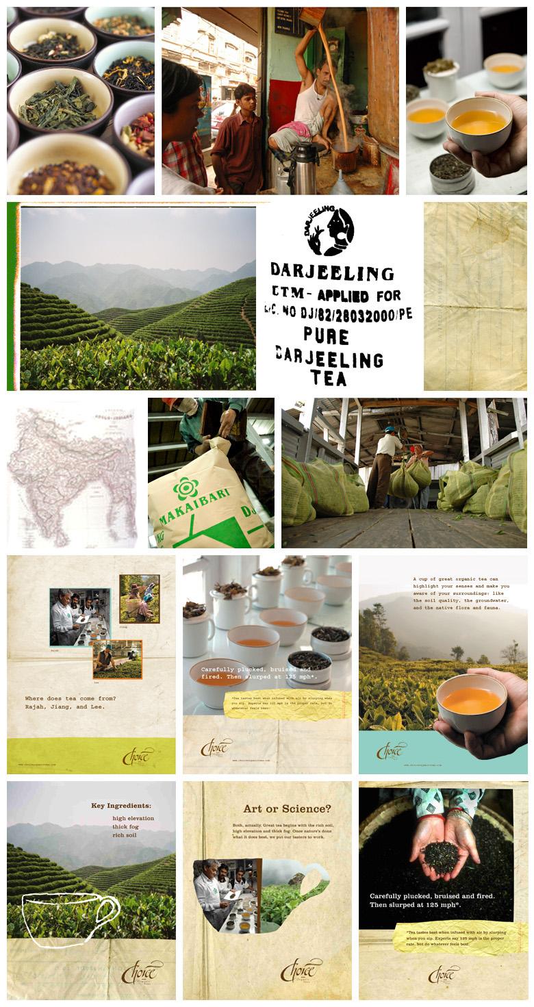
In order to expand on the new brand look and feel for marketing materials, we delved into photo studies and a wide range of design exploration. The refined brand expression was carried through print and digital advertising, point of sale, trade show and sales materials.
Digital
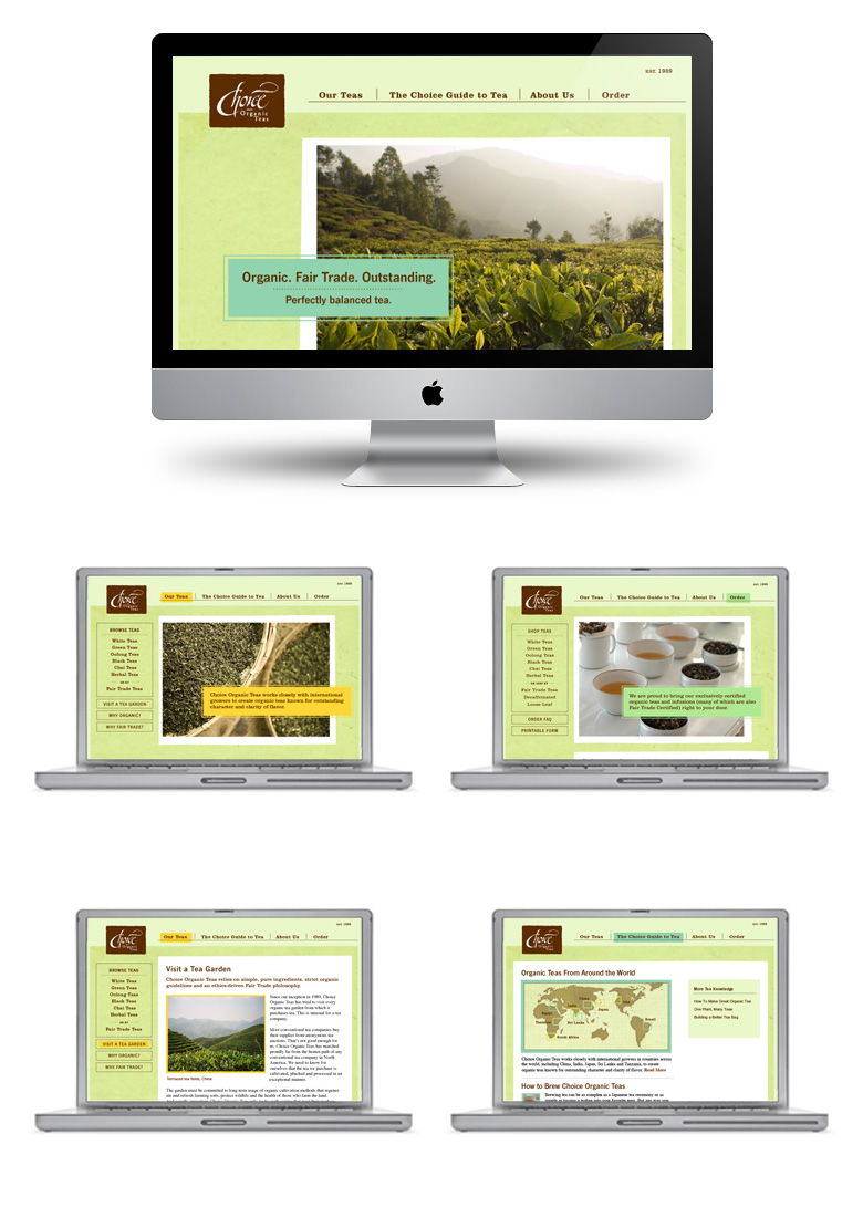
Before & After
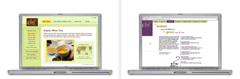
The new unified brand look was applied across multiple categories, starting with the website, where we extended the concept of transparency and authenticity by applying photojournalistic imagery of our tea regions and growers, and introducing the novel concept of a user-enabled “virtual tea estate visit.” Users can click on a tea variety and easily toggle to the place where it's grown, learn about its provenance, terroir and flavor profile, and meet the growers.
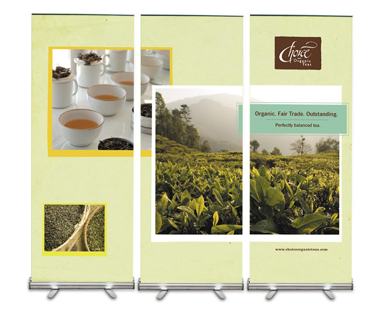
Print, Collateral, POS
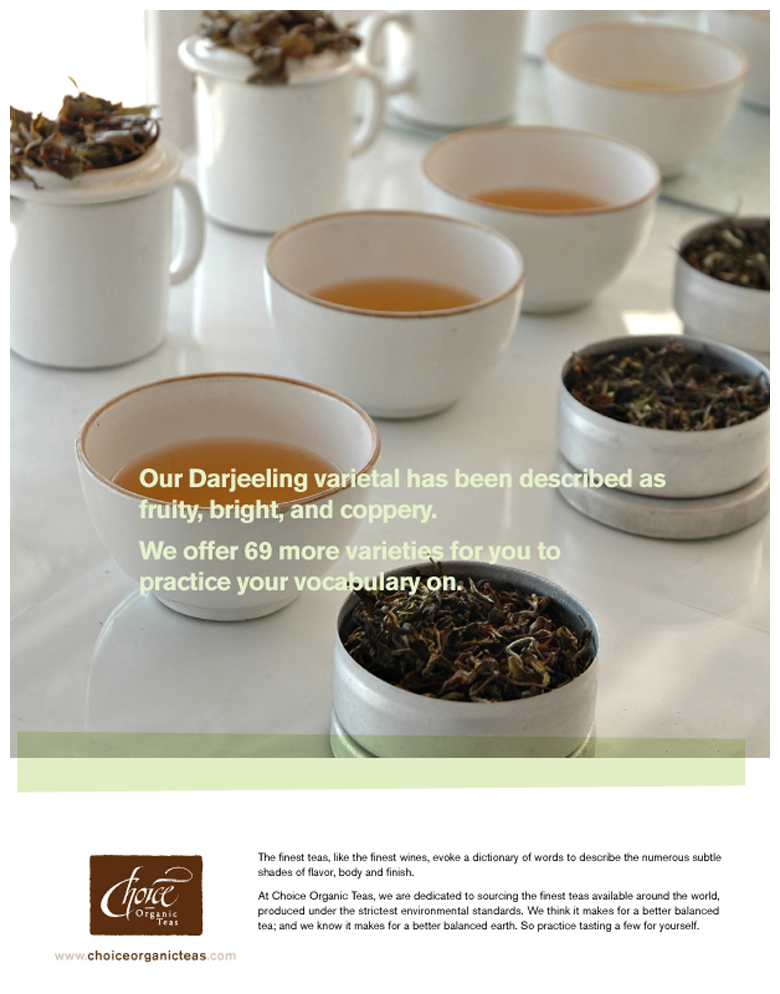
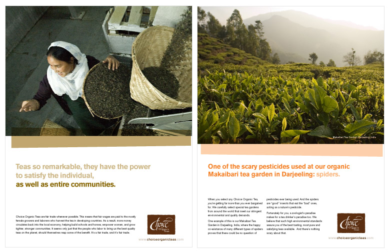
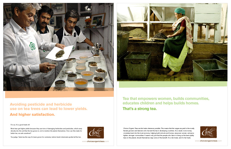
The print captures the essence of the brand in its fine balance of a bold, honest look and feel, with a smart, confident voice and tone. Powerful copywriting addresses key brand attributes, and a sophisticated editorial photographic feel conveys authenticity in a highly evocative manner.